.net has a new Logo now – and I don’t like it.

As unveiled during the PDC in October 2008
Today, Microsoft unveiled a new Logo for the .net Framework, "The Wave". To quote Scott Barnes, "We needed a logo that was in sync with the key values that we want .NET to stand for: consistency, robustness and great user experiences." and later "aligned with the portfolio of brands that .NET is most strongly aligned with: Silverlight, Visual Studio and the AppPlat server products."

Old Win2000-Style Logo
To give my summary right away: I don't like the logo. I think it's boring, because it lacks attitude, personality, charm. I fail to see how this represents robustness and great user experiences. But I don't want to turn this into an overly critic post. Let's have a look at the old .net Logo for a moment. Wow. That was... bad. To be fair, it was in line with Microsofts branding at the time, if you look at Windows ME or Windows 2000 and associated Server Products. But that clearly looks dated now, 8 years later. Not many people seem to know the logo, and I can understand why. The .net Framework surely needed a new logo.
So let's look at some of the other logos Microsoft came up with.
 Surface |
 Silverlight |
 Visual Studio |
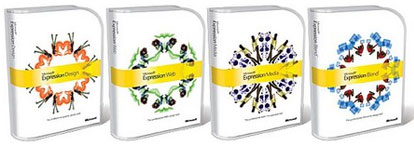
 Expression |
||
Each one of these logos has their own sort of dynamic. Each one of them has attitude. The Expression Mandalas are a quite extreme way of branding, but that makes them somewhat unique. Visual Studio is still one of my favorite Logos for any Product by any Company, ever. I mean, it's INFINITY, but also with Gradients and colors to not only make the logo more interesting, but also to carry a message: Integrating multiple components (Languages) into one product that allows you to use everything to create one infinite stream. That's cool. Surface is also almost equally good at carrying a message. On one side, it's dynamic and natural due to the curves that represent a trails that your finger makes when using it. But it is also shaped like a human, to emphasize on the fact that it's a human-centric product. Silverlight on the other hand has no message visible at first, but it is a quite abstract and attractive "smoke cloud" that at least makes it look non-generic.
Now, the new .net Logo surely has some message as well. They are multiple layers, all going in the same direction. That could be seen as the message of consistency among .net Languages. Also, the multiple layers look like a "reinforced" Wave, which could point out robustness. But then, the sharp corners make it look like it's not very dynamic and it emphasizes that there are some really hard limits on the edges that prevent the wave from fully expanding. I mean: Sure, the .net Framework HAS limitations, and that is not meant as a negative things. It really shines in some areas (Web and Application Development) and is not really that great or usable in other areas (Game and Operating System development, despite XNA and Singularity). But should the logo really emphasize these limits instead of purely focusing on the strengths?
Also, I think the logo is a bit too "heavy". If you look at Surface, Silverlight and Expressionl, you see that they are very lightweight due to use of transparency and bright colors. The Visual Studio logo is a bit more heavy, but uses very vibrant colors. The new .net Logo on the other hand uses this very dark blue as it's center color, which makes the lighter shades on the edges not really visible.
Maybe it's just because the logo is new and unknown that I am a bit sceptic, but the other logos were usually Love at first sight. Well, I think I have to try to get a Business Card once Scott Hanselman got new ones to see how it looks in the Wild 🙂
Disclaimer: I am not a Designer, I am NOT able to create a better logo, so don't bother asking, and this post was subjective and not meant to offend the designers and the people who like the logo.
I thought it was clever how the designer made the wave itself subtly display M S.
Q
The wavy thing looks like the PS3 animated backdrop to me.
Not only does the Visual Studio logo look great but it's motto is cool too : "Defy all challenges"